MyZurich
App
Designing a digitalised experience for Zurich insurance policy customers.
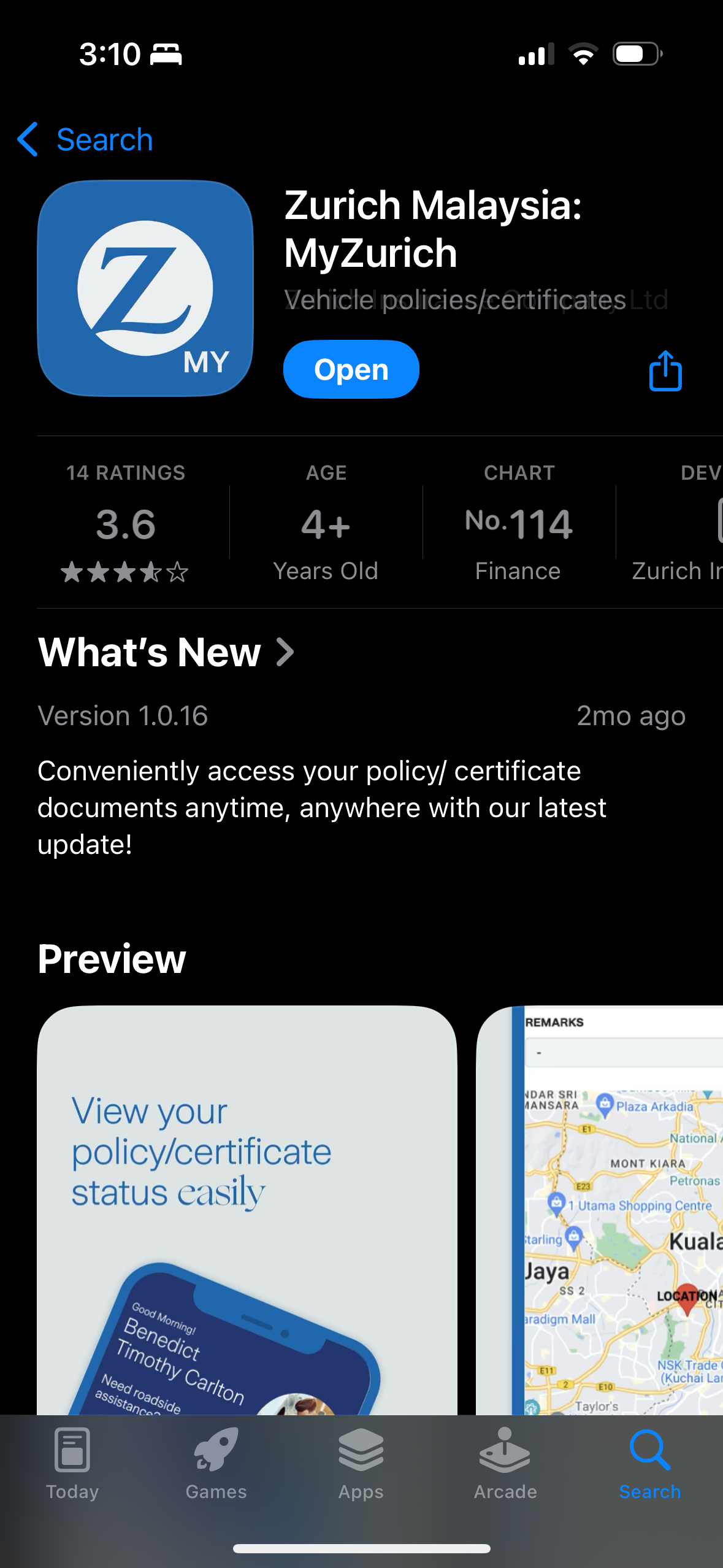
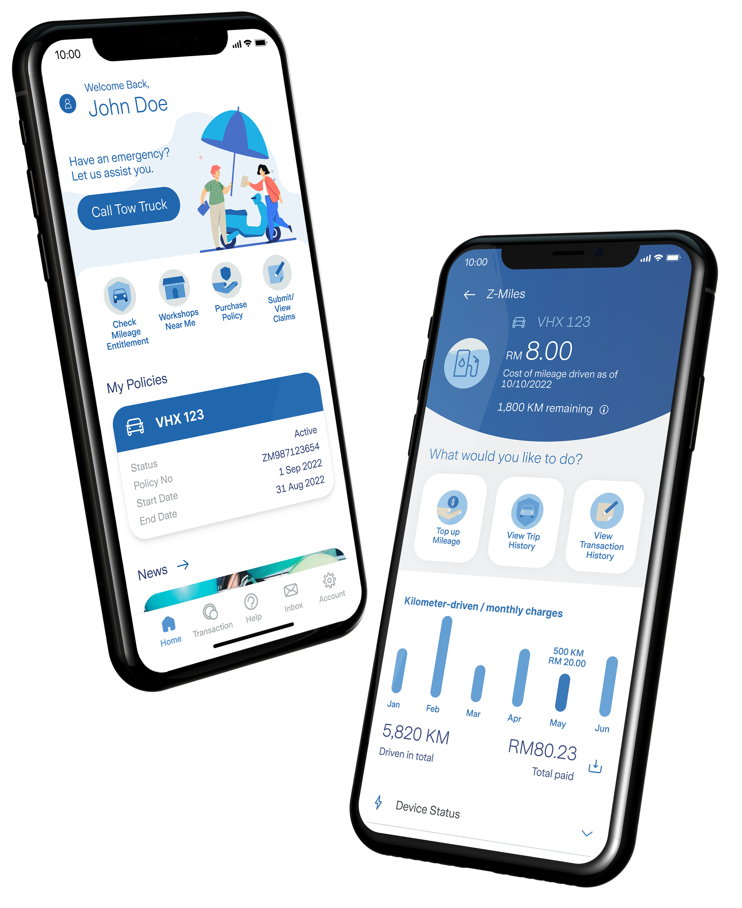
Zurich Insurance Malaysia wanted to create a user-friendly and intuitive mobile app for Zurich customers. The goal is to provide a functional interface for customers to easily manage their insurance policies in terms of making claims, transactions, a record of motor insurance miles traveled, an overview of their insurance benefits, and calling tow trucks.
The Client
Zurich
My Role
UI/UX Design
Date
Oct–Dec 2022
Made with

The Challenges
Product Complexity
The insurance product's pay-as-you-go model introduced a steep learning curve. Presenting data in a way that is both accurate and easily understood required careful decision-making around information hierarchy—what to surface and what to omit—to avoid overwhelming the user.
Stakeholder Management
Navigating changing requirements and aligning expectations was a key challenge throughout the project. This involved setting realistic timelines, clearly defining scope at each stage, and maintaining open communication to keep stakeholders informed of progress and trade-offs.
Limited UX Research
While initial user feedback was generally positive, the biggest challenge was the limited time available to conduct in-depth research. This constraint affected our ability to test multiple design iterations, explore edge cases, and uncover deeper user insights. As a result, design decisions had to be made with quick judgment and limited validation.
Design Process




Foundational UX Research
Understanding the Problem
I conducted a workshop with the team to uncover the following user pain points:
Users are unclear about the cost breakdown of their insurance policy.
Users are unaware of what their full insurance benefits entail.
Users may forget the date of their renewed insurance policy and has to manually track them.
User has to renew insurance manually.
Market Research
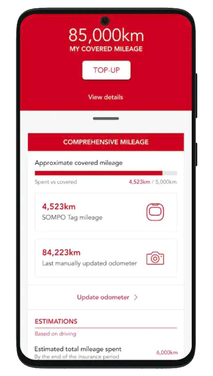
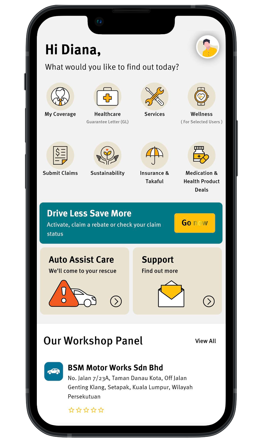
I did some market research on competitors to investigate what are current solutions being offered to similar target audience. The Sompo MotorSafe app and the Etiqa Smile App best pits against our potential product.
Some of the key defining features from Sompo MotorSafe app is its detailed trip history which demonstrates transparency in calculated costs.
The Etiqa Smile App offers emergency roadside assistance accessible to the public, whether or not they are policyholders. Users can easily view policies purchased and make claims.
The Solution
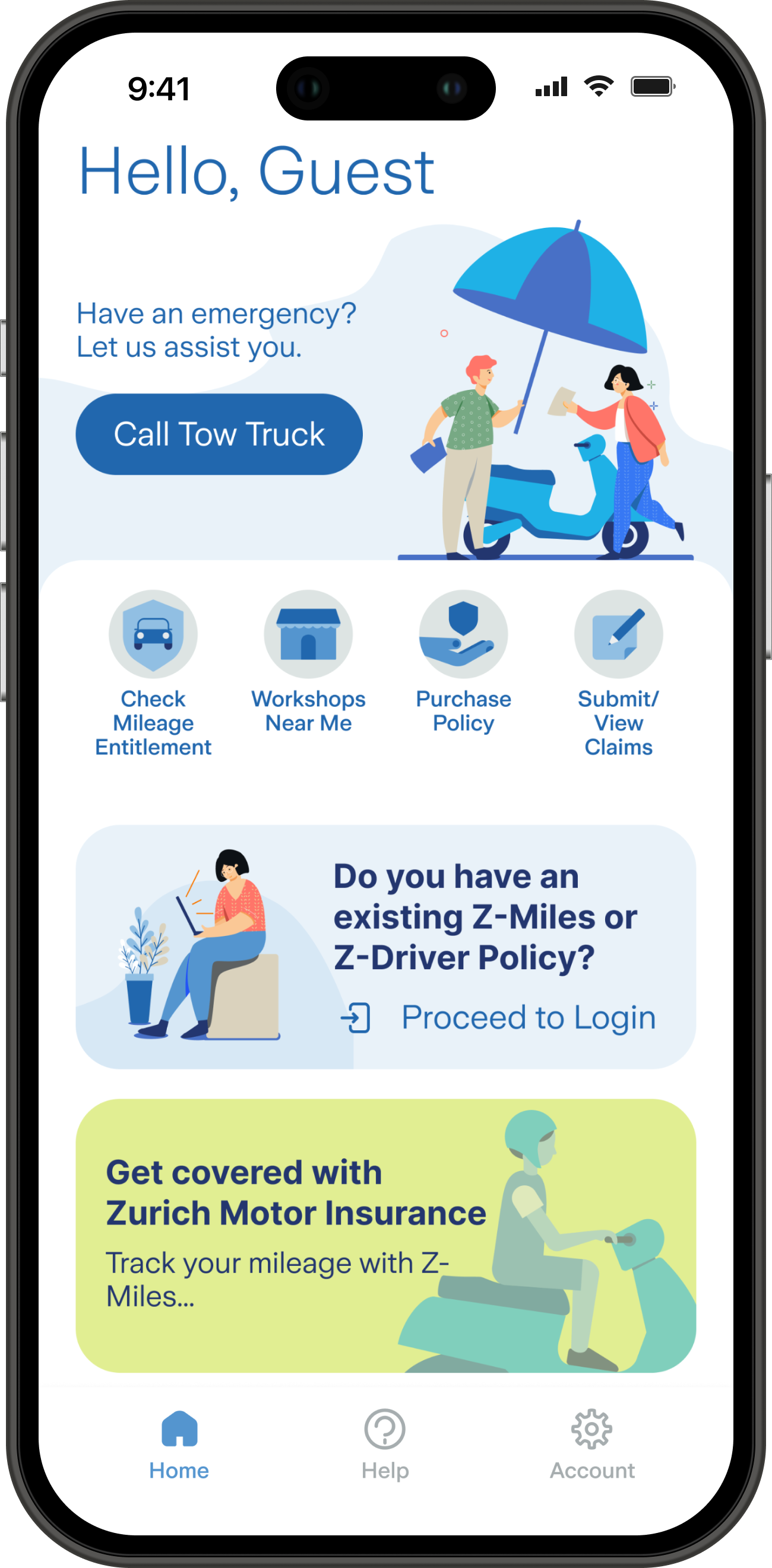
We built a superapp for Zurich related products and services. Our goal was to address existing pain points in the motor app – providing transparency of payments, and allowing users to view benefits enlisted with their insurance policy. Some key prominent features added are roadside assistance and claims processing. We also explored future implementation concepts, such as policy renewal or updating riders through the app.
In addition, we extended our reach to potential users by allowing public users to explore the app. This in turn allows us to capture leads.
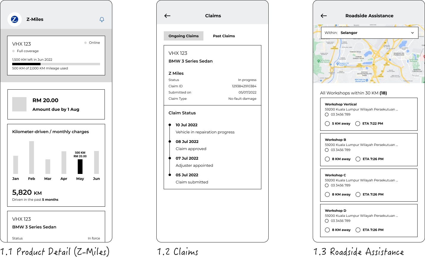
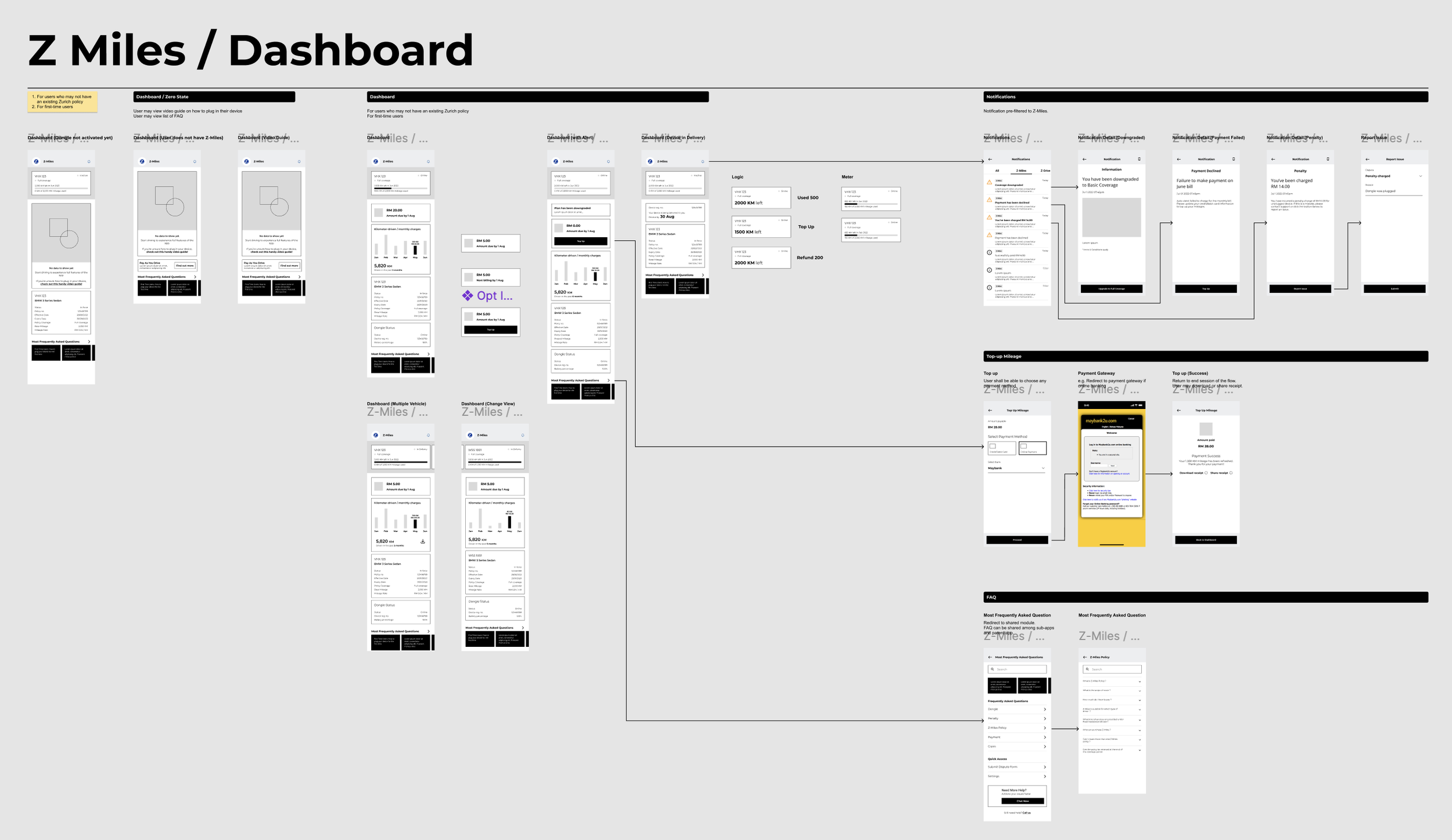
Low-Fidelity Prototype
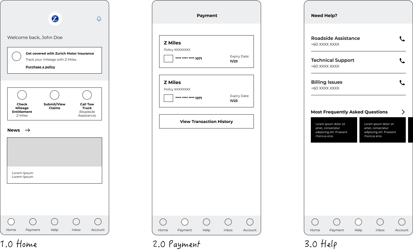
Lo-Fi prototyping helps to focus on what really matters – usability and clarity. This allows us to validate user flow and content hierarchy without being distracted by visual design details, align with stakeholders by focusing on copywriting, and iterate quickly while we prepare hi-fi prototyping simultaneously, to perform guerilla usability testing.
Design Iterations
As we gained a deeper understanding of the business model and gathered feedback from quick guerrilla testing sessions, we made intentional iterations to improve the design.
Guerilla Testing
To quickly validate the usability and clarity of key information on the pay-as-you-go insurance dashboard — specifically, whether users could understand their mileage coverage and how to top up.
Conducted with 5 participants between ages 20-50 in a public setting using a clickable hi-fi prototype. Each session lasted 5–10 minutes, and users were given short, goal-driven tasks related to real-world usage.
Product Detail
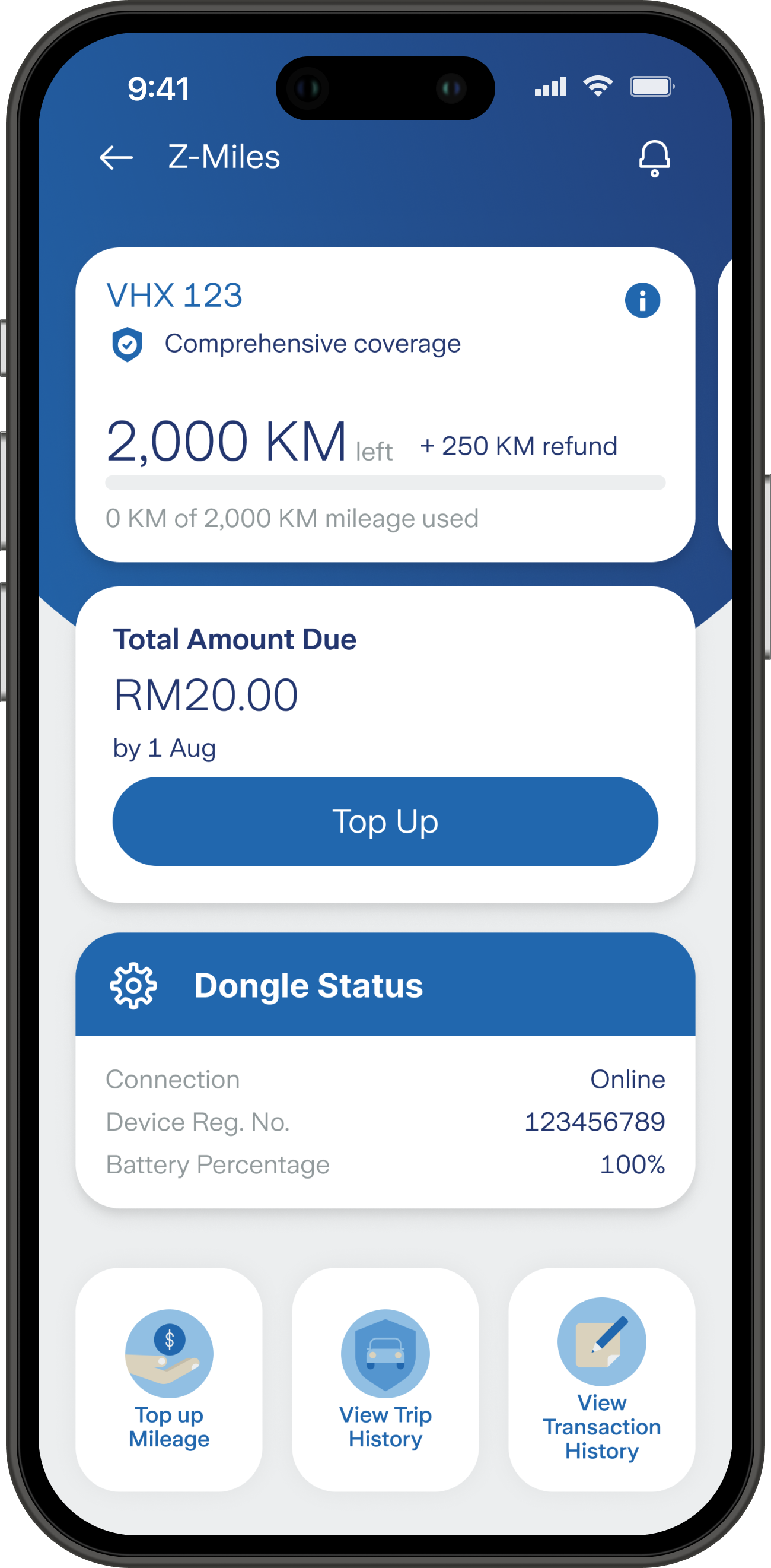
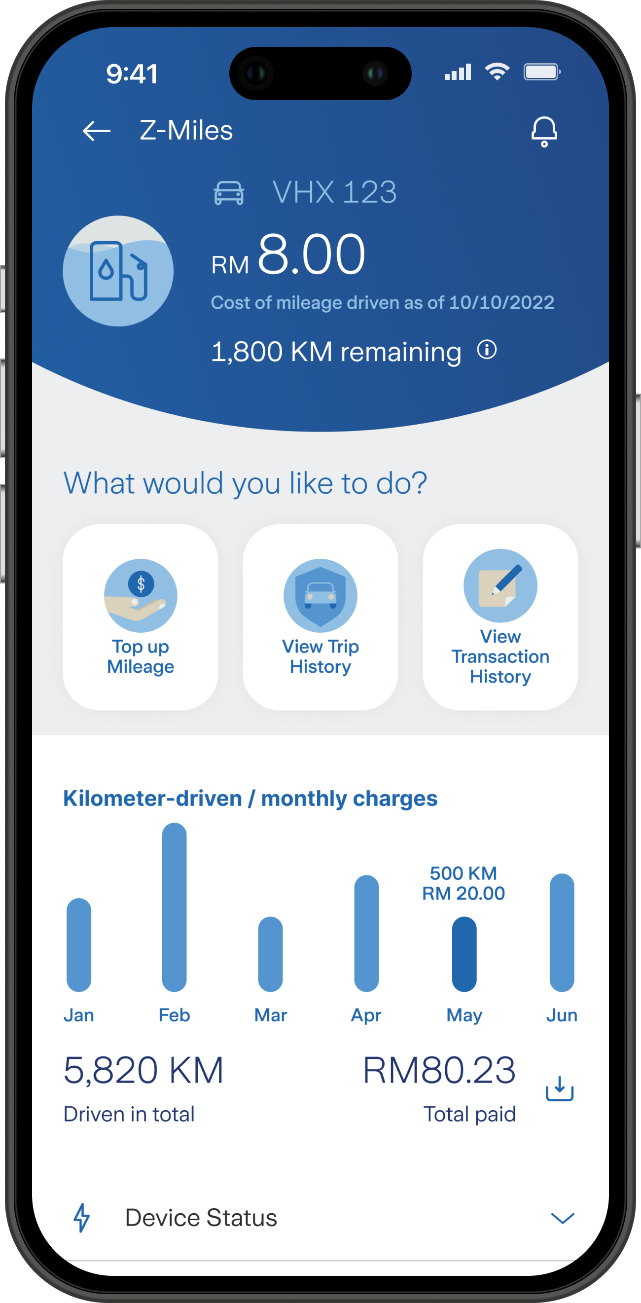
We re-evaluated information displayed:
Improve visual hierarchy with high contrast and design breaks.
Reduce cognitive load by removing unnecessary information.
Display mileage without gauge: user does not require a threshold measurement.
Move actionable items higher.
Users took some time to understand the meter display. 2 out of 5 users tapped the card immediately to find out more information.
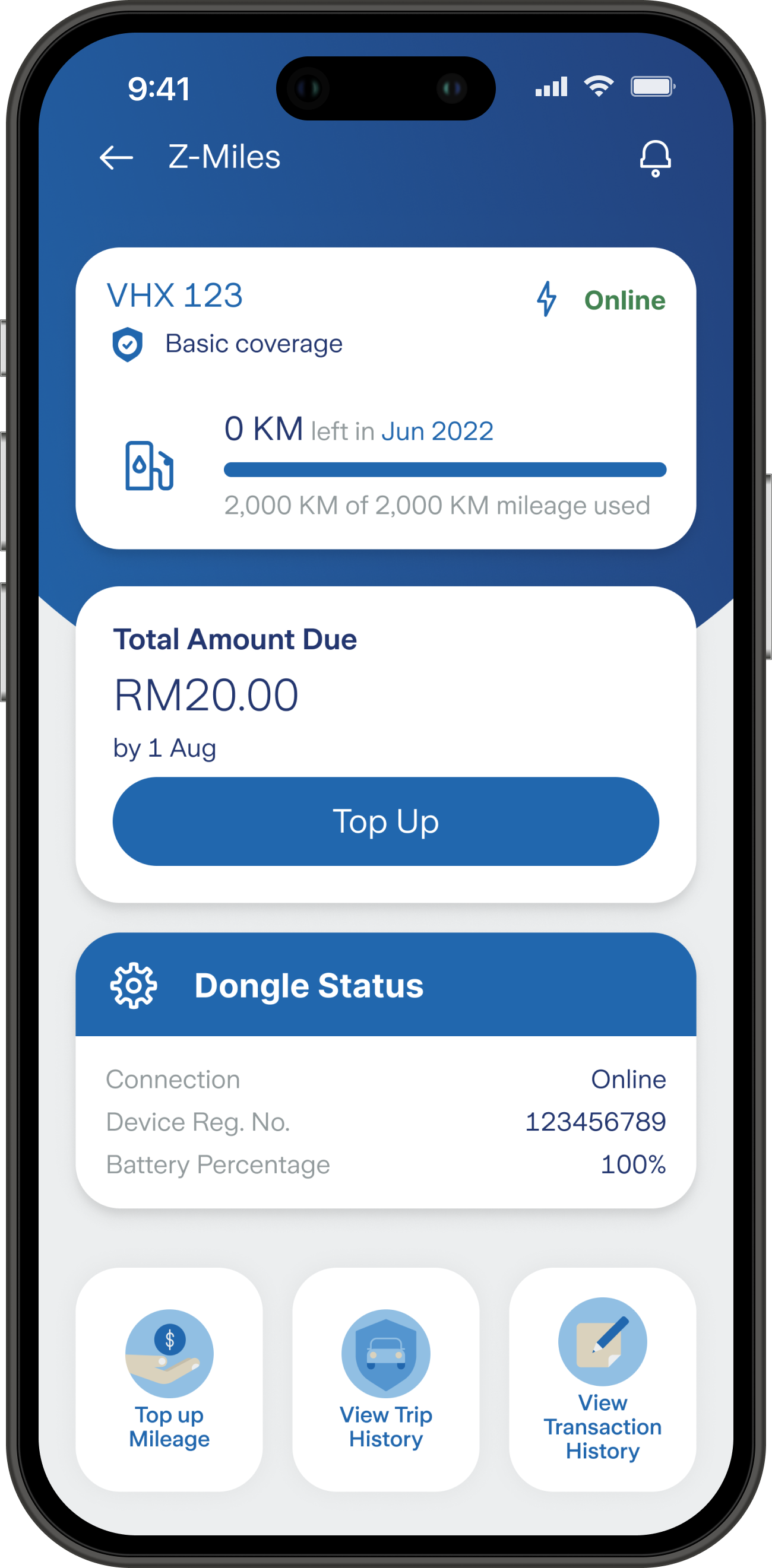

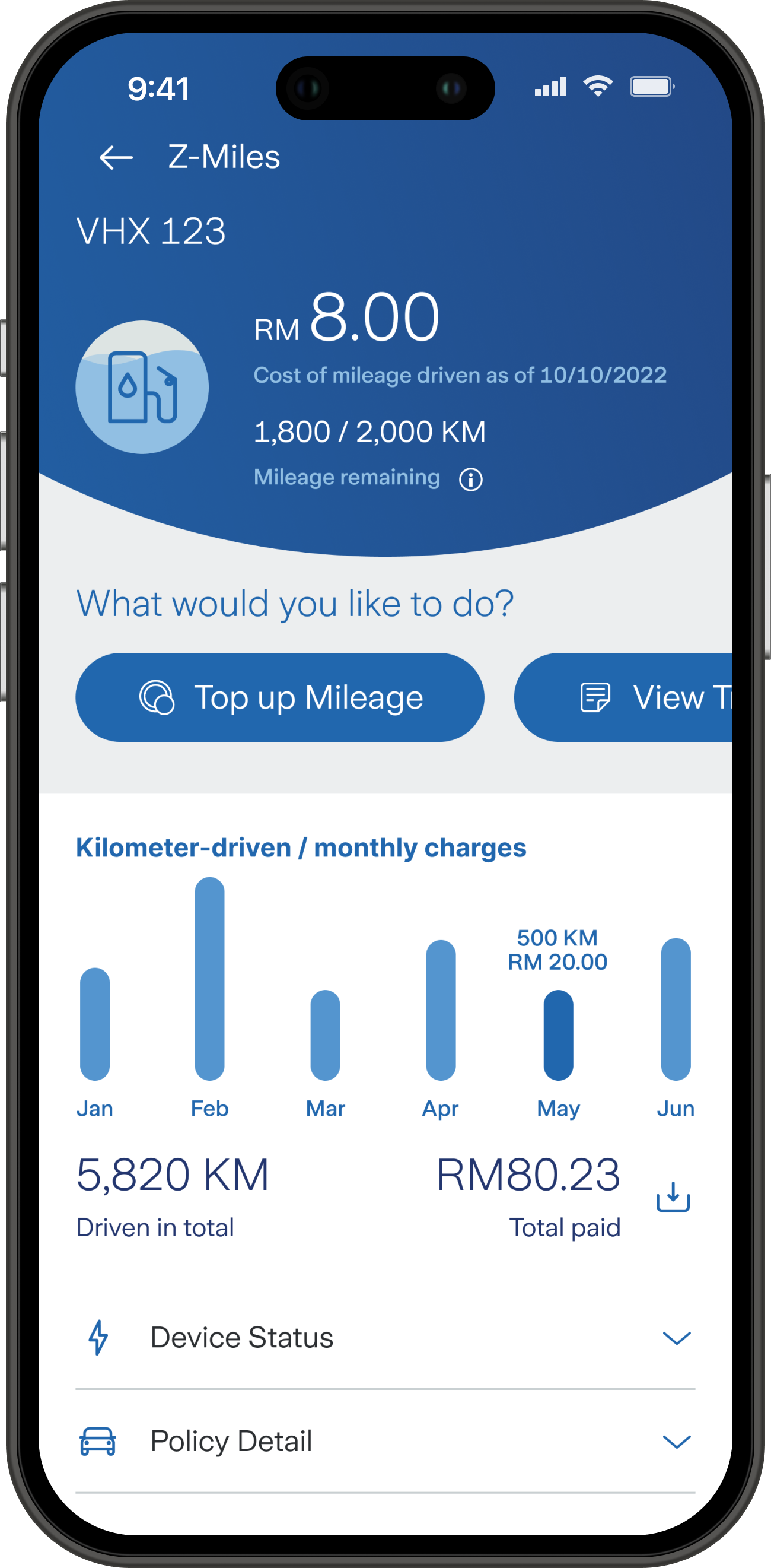
Users skimmed for key numbers first before reading supporting text.
Users appreciated visual cues of mileage breakdowns.
Documentation
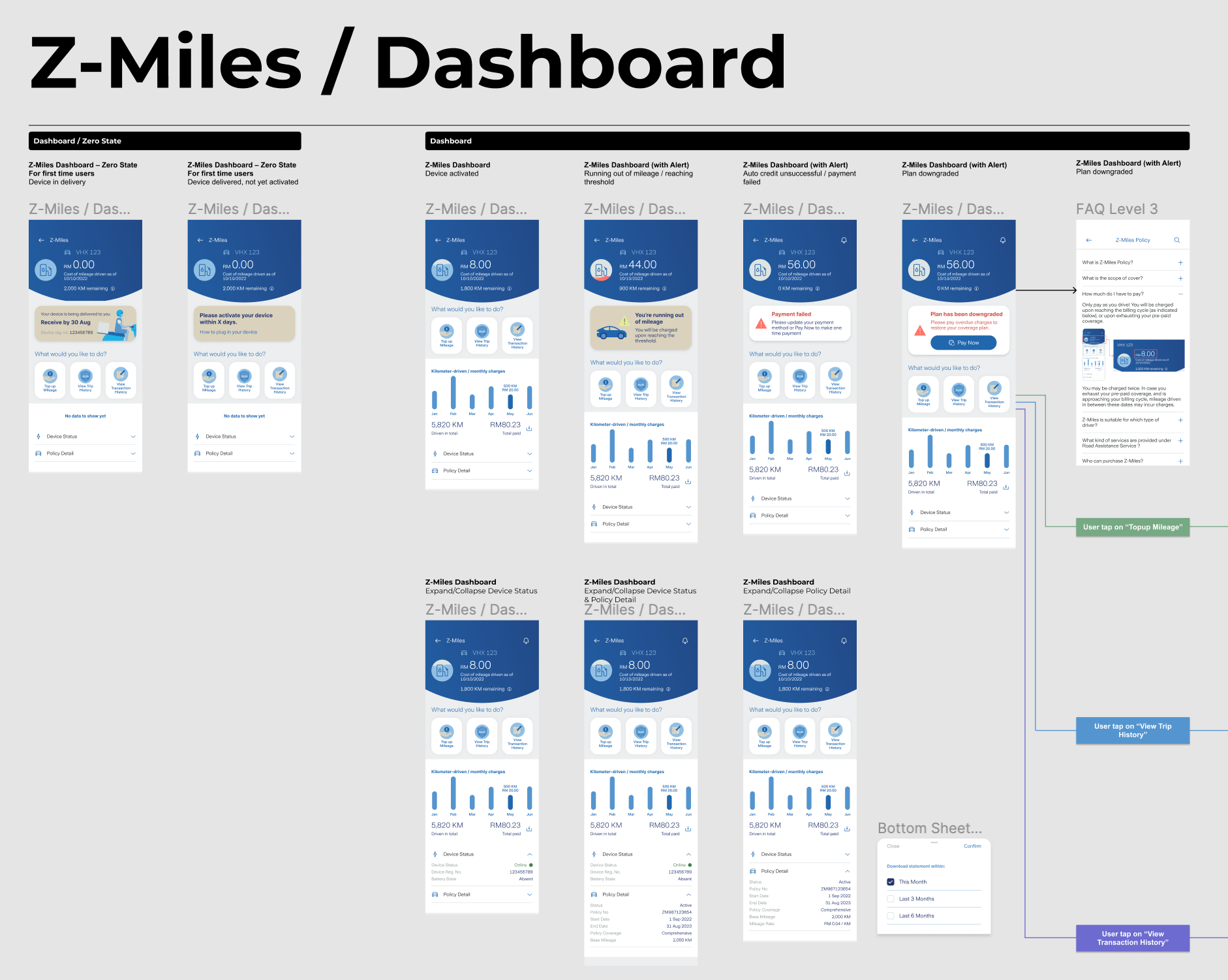
Besides handoff, I also took the liberty of writing a small summary for each screen on the design file used to communicate with the stakeholders.
This way, everyone has a better picture, whether they have been involved with the project the whole time or recently onboarded.
Final Design
Demonstration of Zurich Motors mobile app

App Store
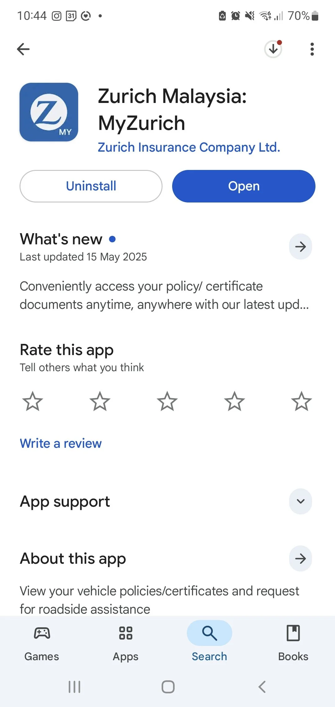

Available on