Redesigning the Heart of MuslimPro for 20 Million Users
When an app outgrows its shell — balancing business ambition with the quiet needs of a deeply faithful user base.
Muslim Pro is one of the world's most-used Islamic apps, serving over 20 million daily active users at its peak during Ramadan — and around 9 million outside of it. The app covers prayer times, Quran, Qibla direction, and a growing suite of AI-generated content. Over time, the product expanded significantly: new features were introduced, Qalbox — a dedicated Muslim entertainment platform — was integrated as a promoted vertical, and a new brand design system was established.
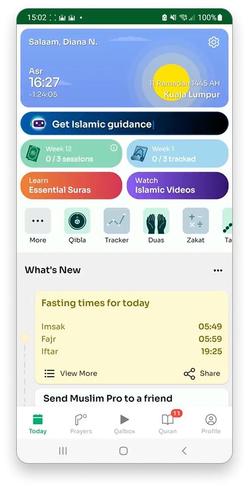
The home screen, however, remained largely unchanged. It was no longer representative of the product it sat at the front of: cluttered with competing new features, inconsistent with the updated design system, and losing focus of core features.
The Client
Muslim Pro
Design & Research
My Role
Date
Oct ‘23
Made with

The Challenge
Reconcile competing priorities on a single, high-traffic screen — updating the design system, establishing a clearer information hierarchy, and integrating Qalbox promotion while preserving the usability and satisfaction of 9 million DAU who open the app multiple times daily.
My Process
Before any design work began, the priority was alignment — ensuring the problem was understood the same way across functions, and that every team had a stake in defining it.
Identifying the Problem
Before any design work began, the priority was alignment — ensuring the problem was understood the same way across functions, and that every team had a stake in defining it.
1
2
Validation of user pain points & sentiment regarding core features via existing Google Playstore / App Store reviews & Usage / Engagement analytics.
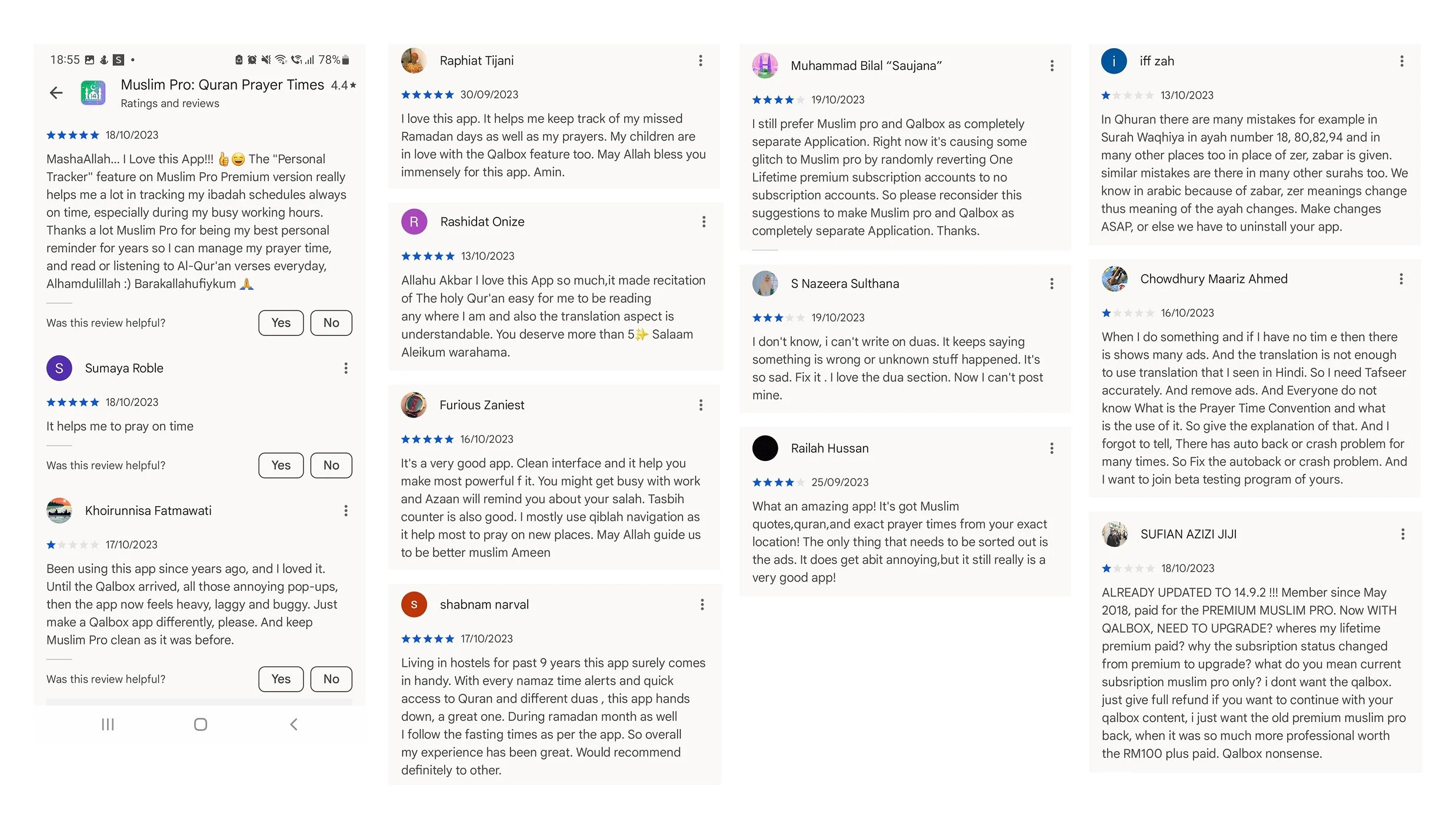
I started by reviewing user feedback across the Google Play Store and App Store to establish existing sentiments base independent of internal assumptions. Across ratings from 1 to 5 stars, a consistent picture emerged from the 20 latest feedbacks.
Despite this, many users expressed strong loyalty and affection for the app — the satisfaction was real, and the frustration came precisely because expectations were high.
Aligning the team with a sailboat exercise
We held a sailboat exercise as part of our new design workshop to build shared problem understanding and ownership across stakeholders from Marketing, Engineering, and Product.
What emerged from the review analysis and the sailboat session was a clear map of the competing demands on a single, high-traffic surface.
Alongside this, the home screen carried significant design debt: outdated UI patterns, inconsistent component usage, and a layout that hadn't been rethought holistically since the app's earlier, simpler days — all of which needed to be addressed within the same project scope.
Core features — prayer times, Quran, duas, and Qibla
— users relied on these features daily and valued them most. These needed to be immediately accessible, with no friction.
User needs
Fast, uninterrupted access to prayer times, Quran, and Qibla. A calm, focused experience suited to high-frequency, habitual use — often multiple times a day.
Ads as a friction
Ads are a consistent complaint across free-tier users, reinforcing the sensitivity around anything that read as promotional on a screen users opened for spiritual practice.
Business needs
Visible promotion of Qalbox to drive cross-app engagement. Surface newer features with low discoverability. Maintain revenue-generating placements without disrupting retention.
As Muslim Pro grew from a simple prayer companion into a feature-rich super-app, its home screen had become cluttered with fragmented UI patterns that no longer reflected the new design system — leaving core features, new capabilities, and promotional content competing for the same first 10 seconds of attention.
Overview
As Muslim Pro grew from a simple prayer companion into a feature-rich super-app, its home screen had become cluttered with fragmented UI patterns that no longer reflected the new design system — leaving core features, new capabilities, and promotional content competing for the same first 10 seconds of attention.
HMW…
make home screen more intuitive and accessible for diverse users with varying pain points?
HMW…
maintain an engaging home screen with changes that satisfies both user and business needs?
HMW…
maintain an accessible home screen experience for global, diverse users
HMW…
personalise recommendation to enhance and/or maintain user engagement?
Ideation
To address the pain points, I identified the following flows and concept that can be expanded and explored:
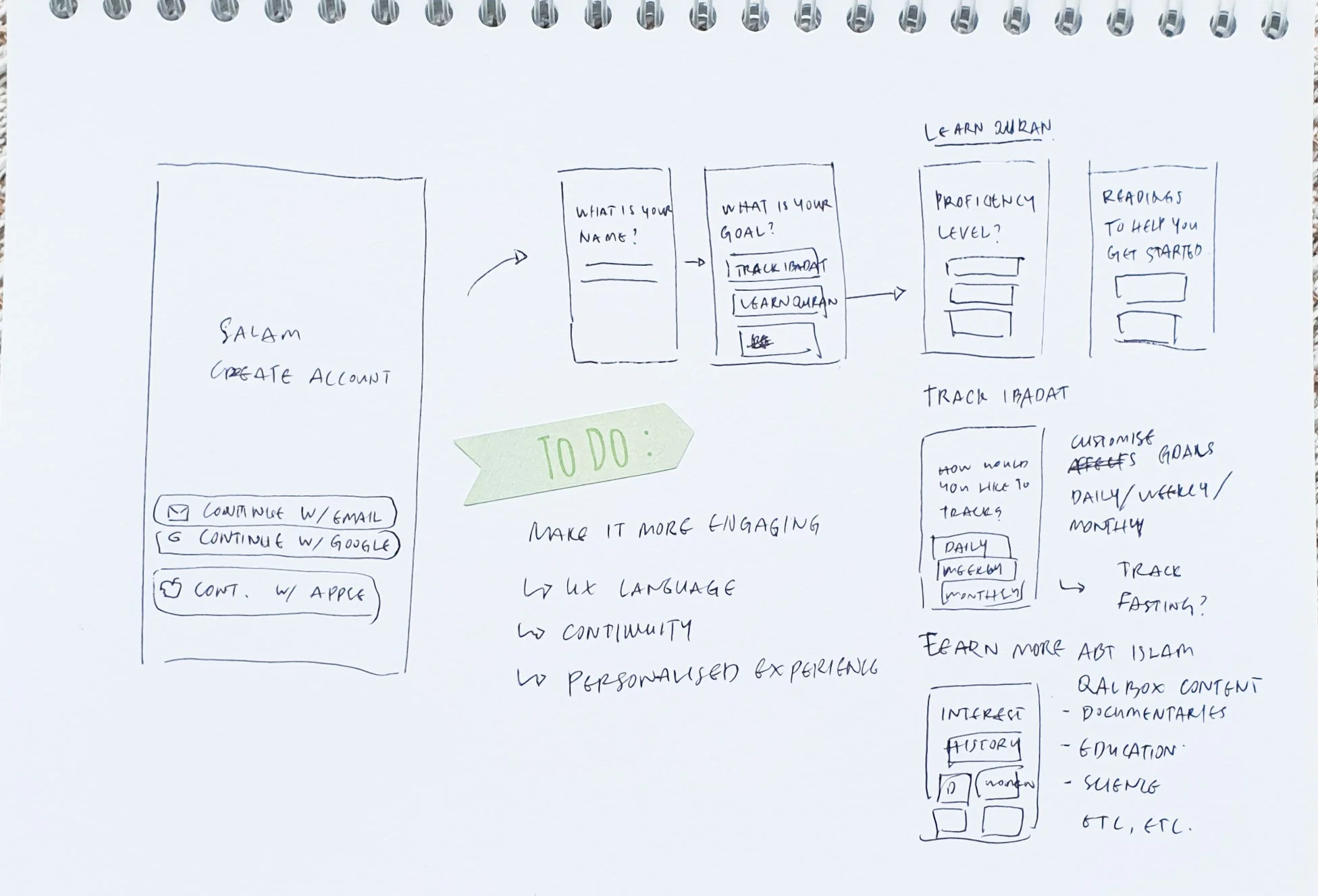
Onboarding Personalisation
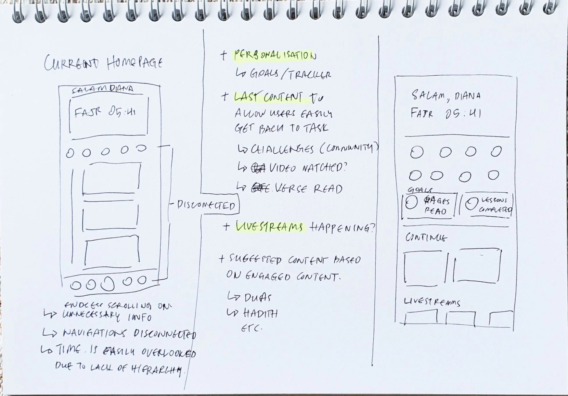
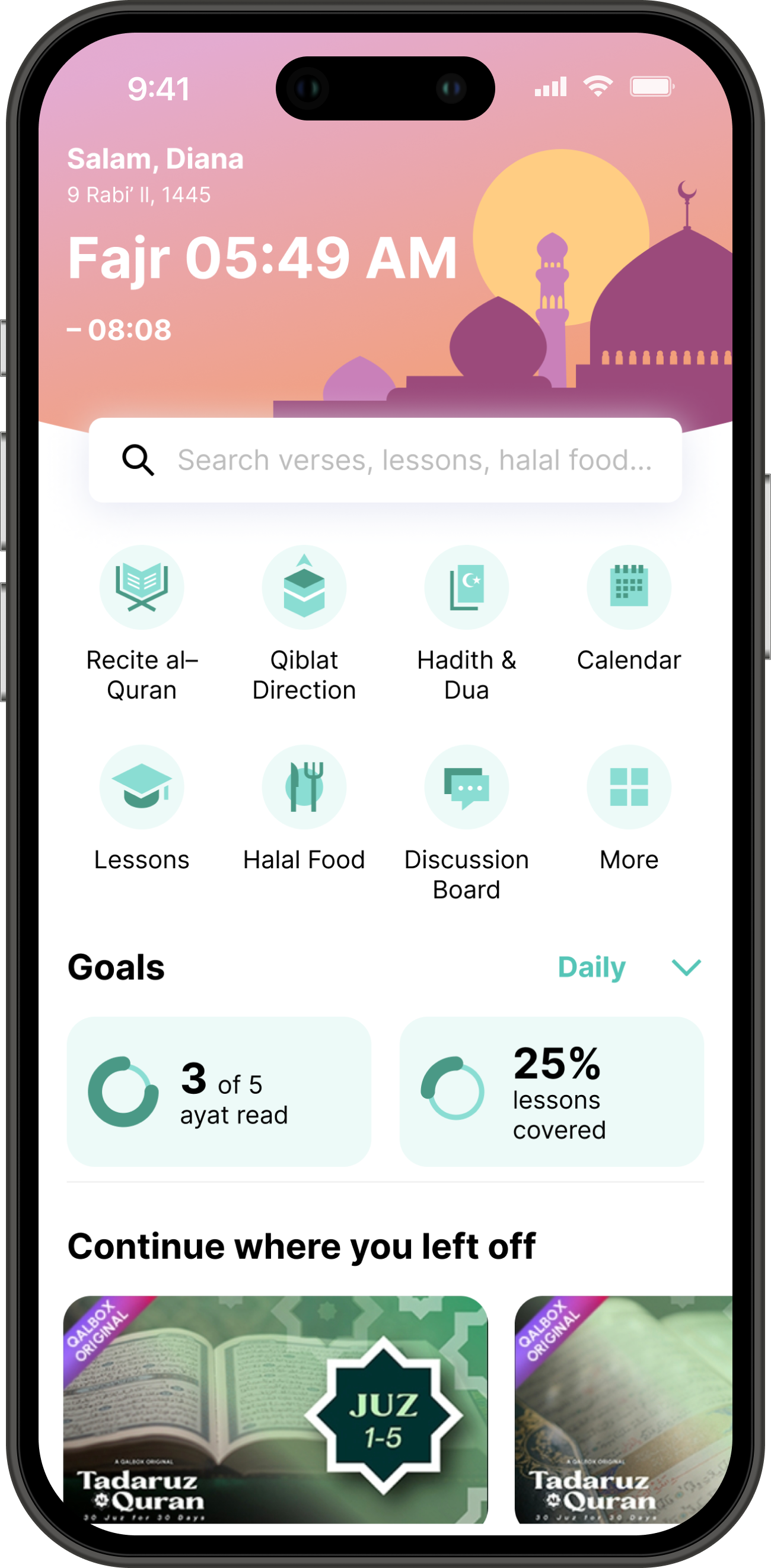
Homepage redesign
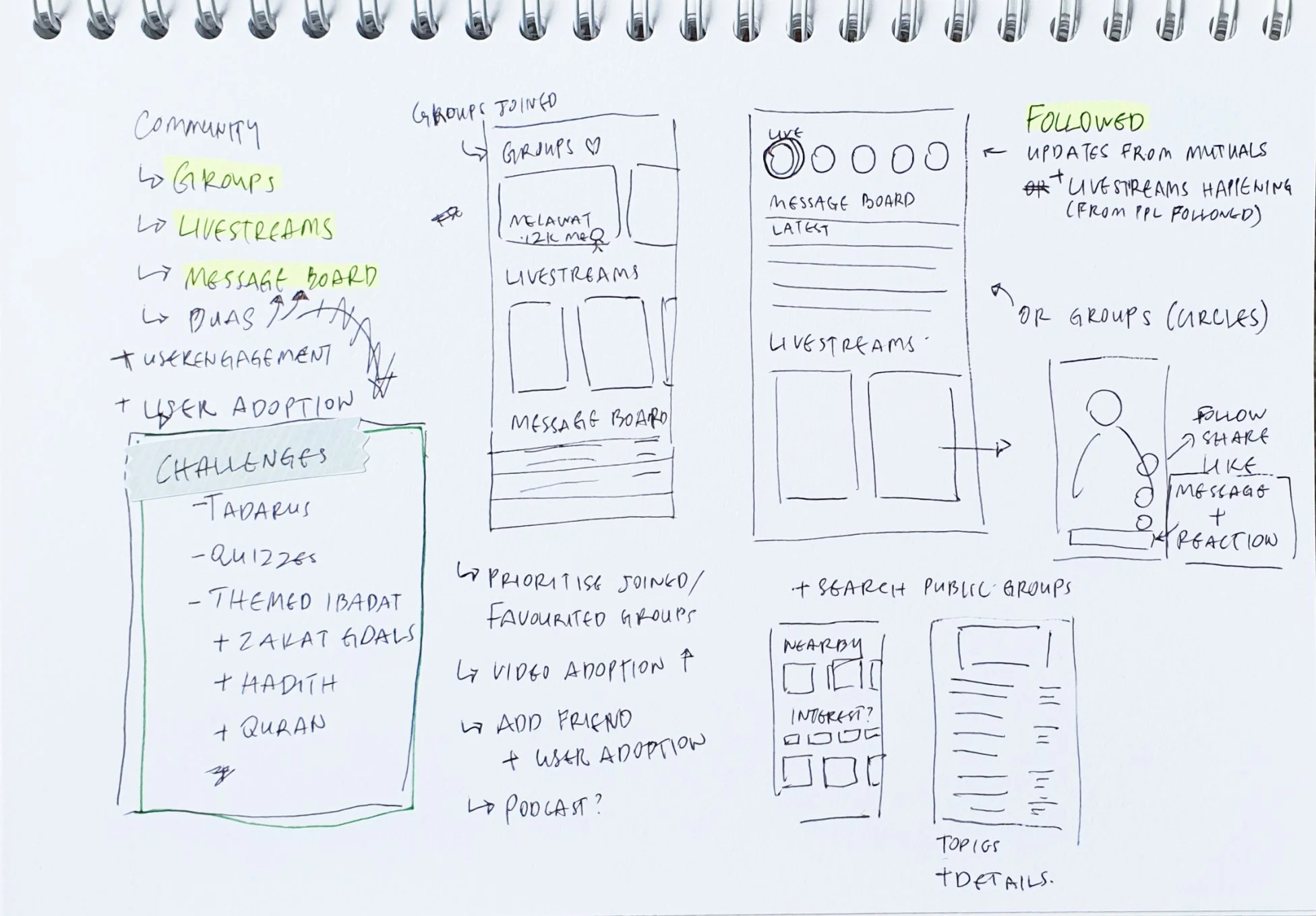
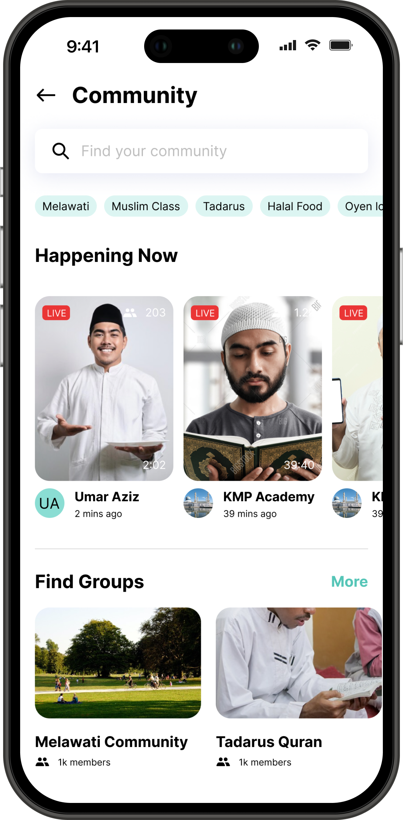
Community Features
Onboarding Personalisation
As a first time user, I want to personalise my experience
User prompted to set language, goals to personalize experience
Guide user upon setup e.g. onboarding users that are learning Quran
Measurement of success:
✓ Increase user engagement
✓ Increase user adoption
Homepage Redesign
As a recurring user, I want to track my ibadah
Quick tutorials to guide first time users
Quick search for recurring users to find and perform task more quickly
Navigation section limited to not confuse the user
Show user statistics and progression to encourage user engagement
Tailor goals to daily, weekly, or monthly according to user usage pattern
Measurement of success:
✓ Increase user conversion
✓ Increase user retention
Homepage Redesign
As a user, I want to engage with the Muslim community
Happening Now – Find Muslim streamers
Recite duas or Quran together
Space for users to find and build community
Measurement of success:
✓ Increase user engagement – time spent on app by interacting with the app features more
✓ Increase user retention
Prototype
Final design of the envisioned Muslim Pro mobile app