Examler
Web App
Designing an Intuitive Exam Creation Platform
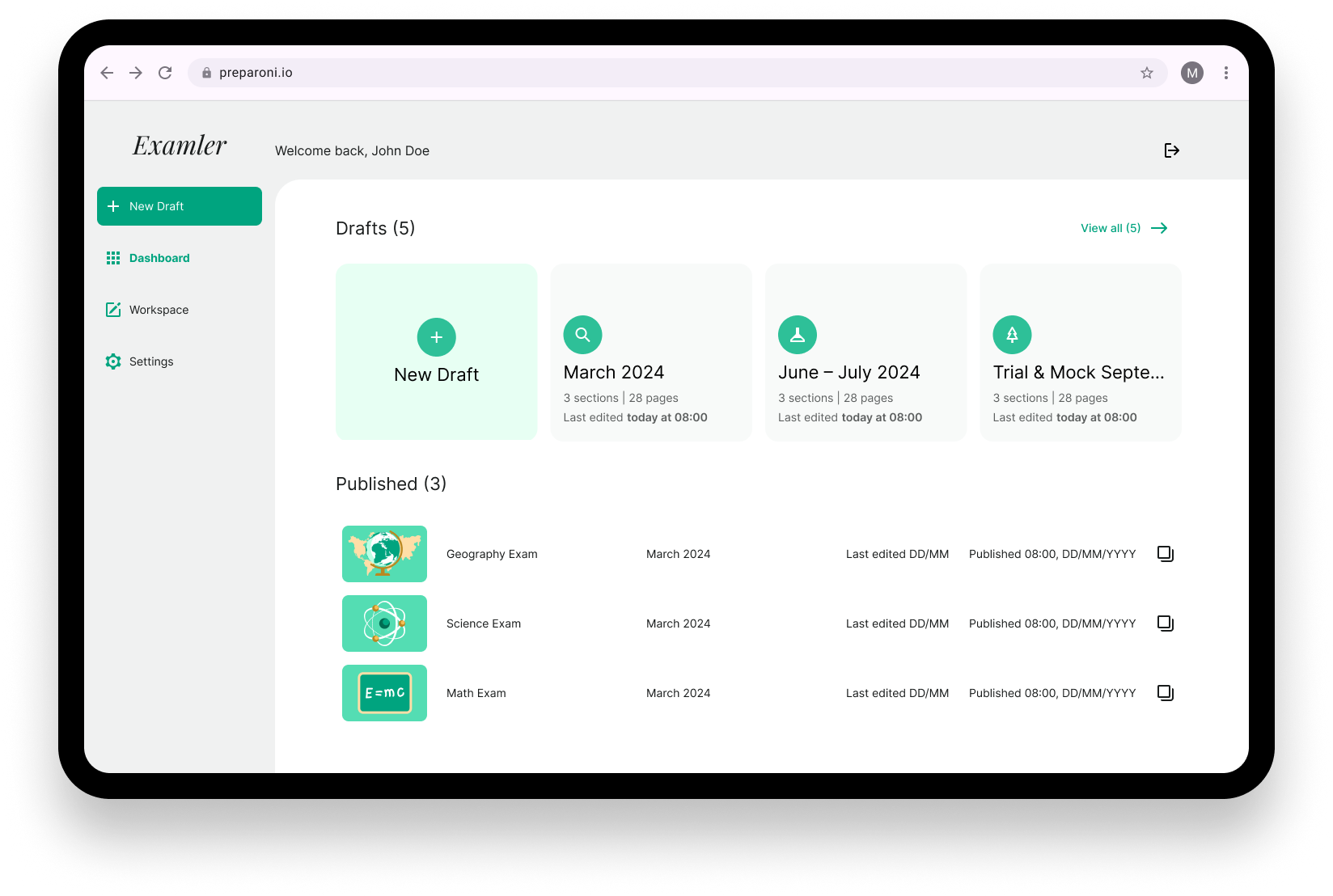
Examler is a web app designed for educators, tutors, and professionals to create, manage, and export exams in various formats, including PDF, Microsoft Word, and Google Docs. It also allows users to generate embed codes for hosting exams on external websites.
Jared (Freelance)
Client
My Role
UI/UX Design
Date
Dec ‘24 - Jan ‘25
Softwares

The Project
Due to the time constraint, I shared assumptions based on the project brief to quickly confirm and align with the client what the project is about.
What It Is:
A web app for creating and exporting exams.
Designed for teachers, administrators, tutors, and professionals.
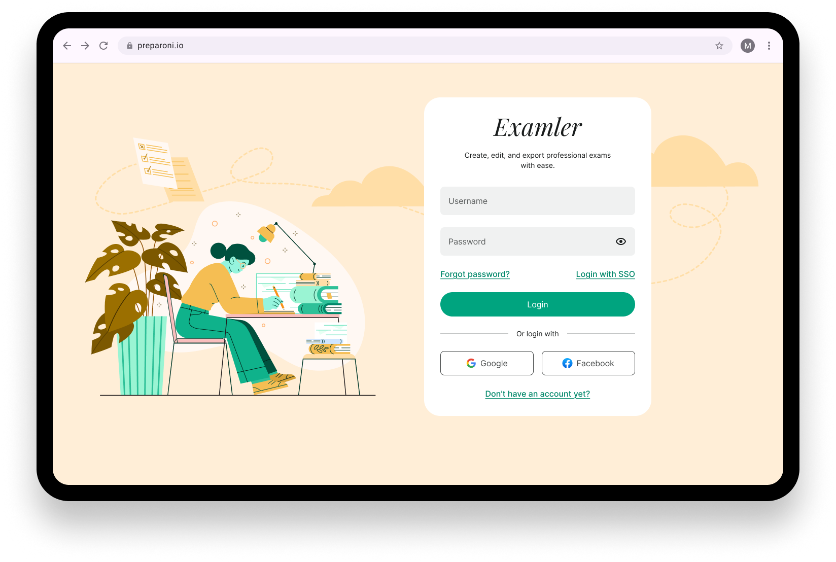
Requires user authentication for access.
Allows users to save and return to unfinished exams.
Offers multiple export options (PDF, Word, Google Doc, and embed code).
What It Isn’t:
Not for students to take exams.
Not an AI-driven exam generator.
Not open for guest exploration.
Not responsive in the initial version.
Design Process
Understand
1
Market Research
2
Lo-Fi Prototyping
3
Brand Identity Exploration
4
Prototype & Test
5
Launch & Iterate
6
Market Research
Typeform
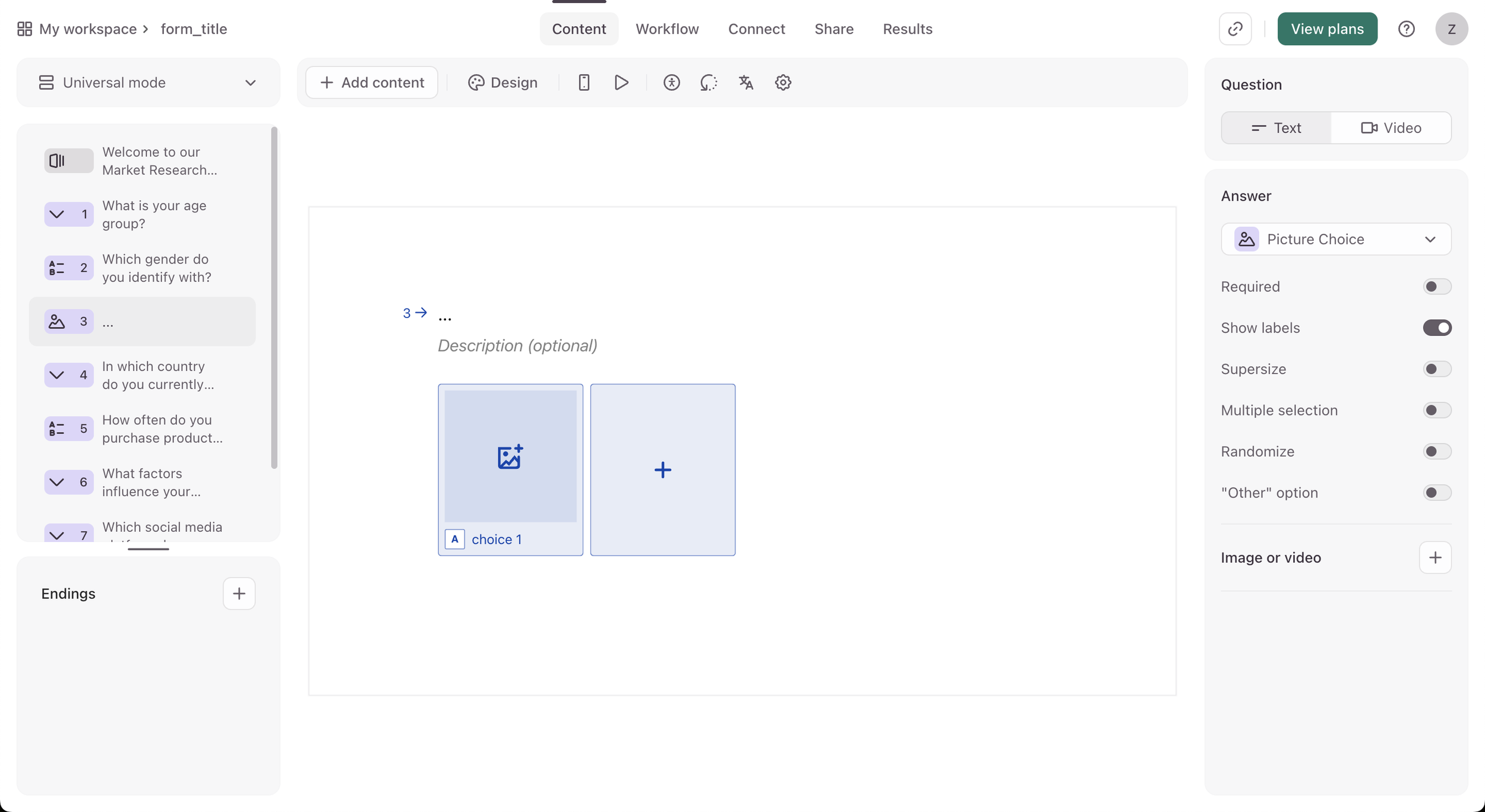
Smooth UX flow
Clean UX / less clutter, allows users to better focus
Sorts by questions rather than tools
Clear logic/tool hierarchy
SurveyMonkey
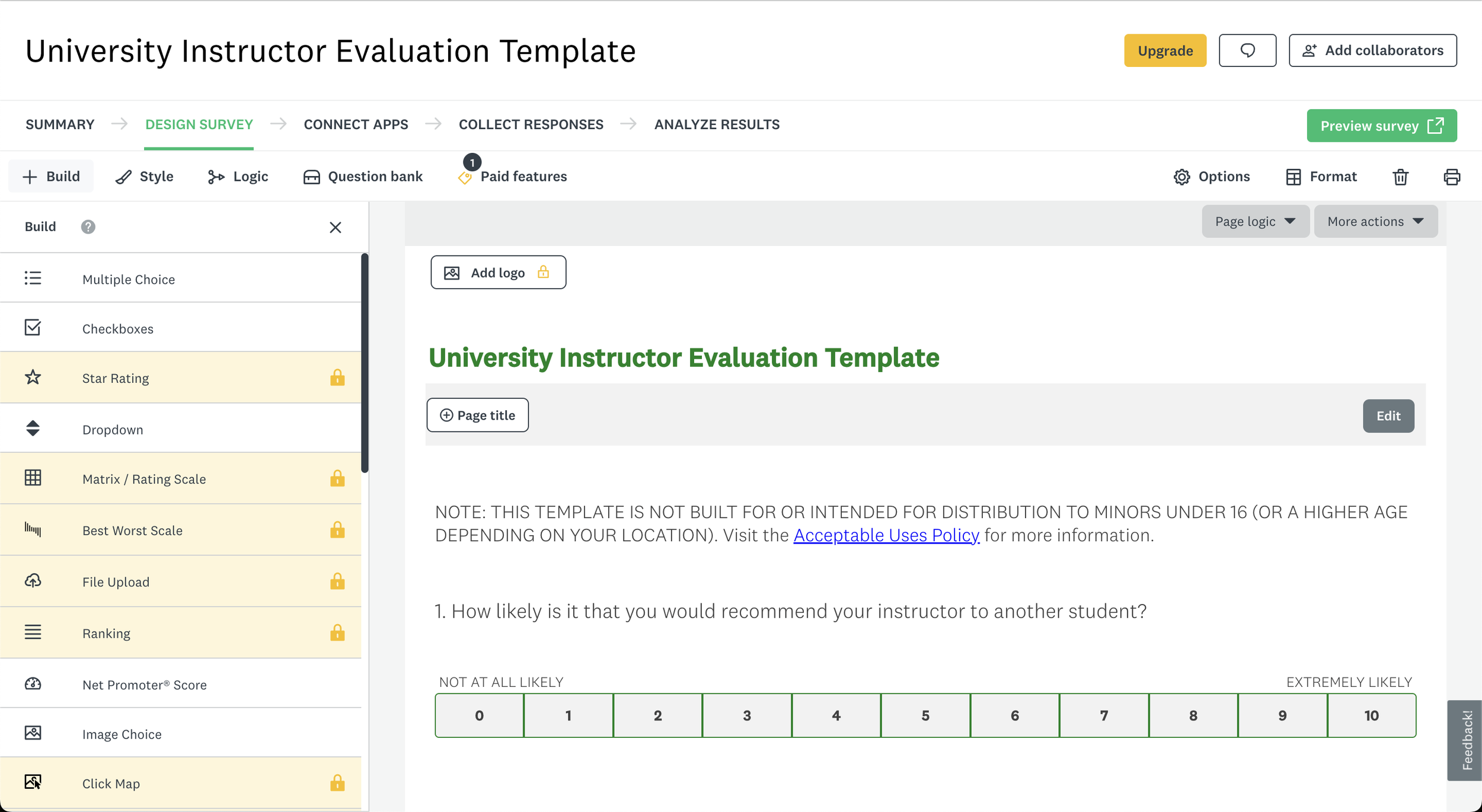
Smooth UX flow in terms of navigation but the builder is cluttered.
More features (data analysis from survey)
Heavily customisable down to detail
Poor UX copy for beginners (complex terms)

The Solution
Low-Fidelity Prototype
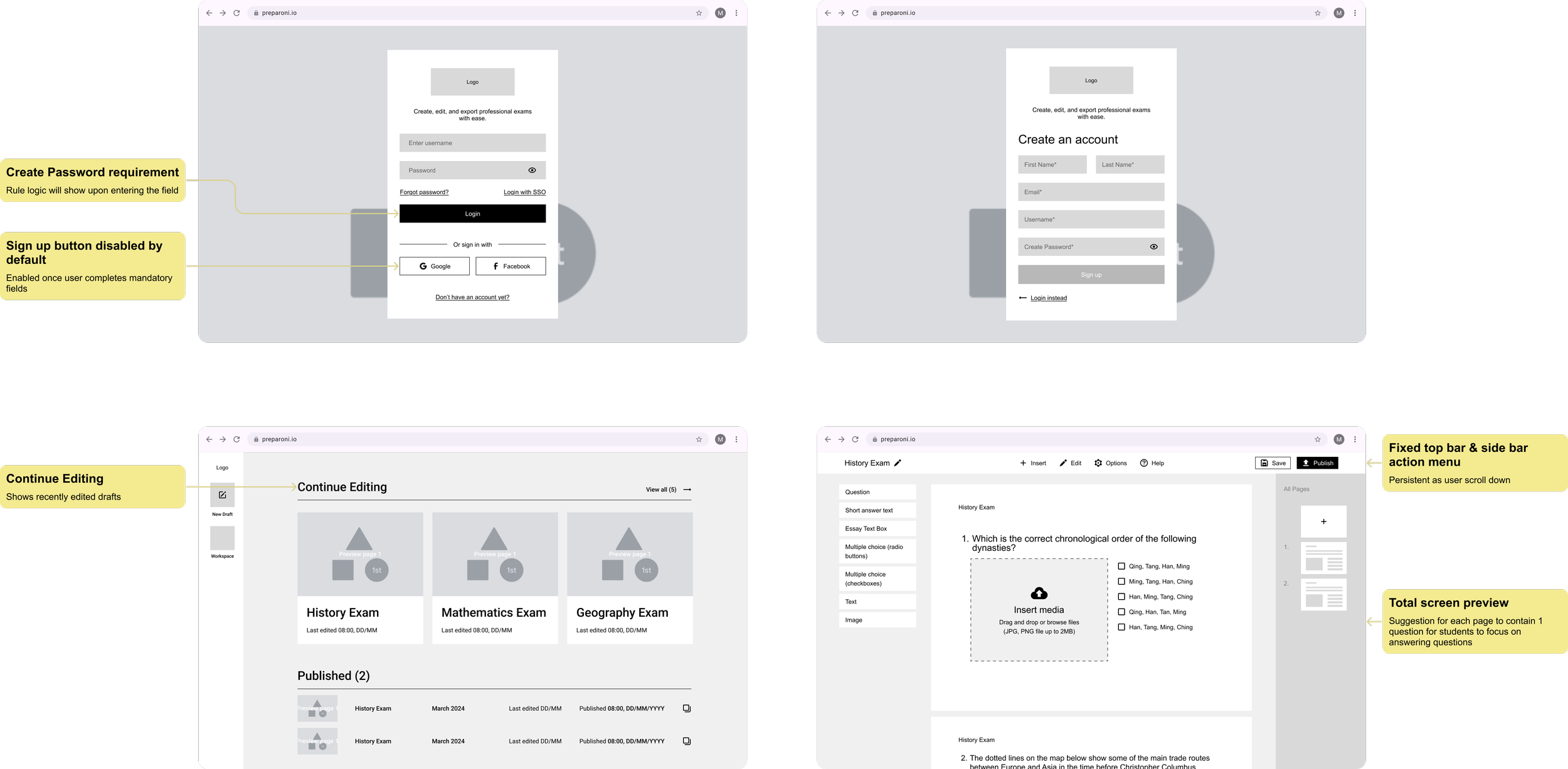
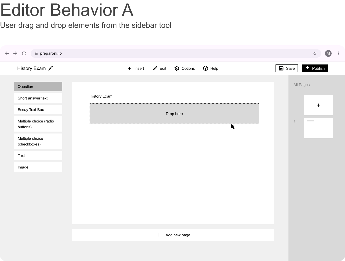
The client provided a foundational information architecture which helped guide the structure of the low-fidelity prototypes. During this phase, I made several UX recommendations to improve usability and user flow—these suggestions were positively received. While awaiting feedback, I began exploring brand identity directions, focusing on color and typography to maintain project momentum.
Brand Identity Exploration
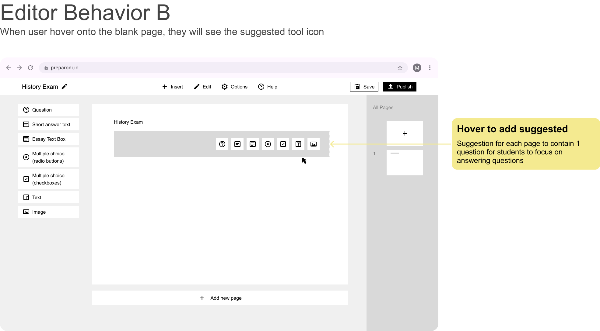
With no existing branding in place, I proposed three distinct visual identity styles, each showcasing different combinations of typography, shape, and color. I grounded my design rationale in color psychology, explaining the emotional and functional qualities each palette could convey. Presenting multiple cohesive directions early on allowed the client to confidently assess and provide clear feedback. This helped the client decide easily and almost instantly on the green primary tone.
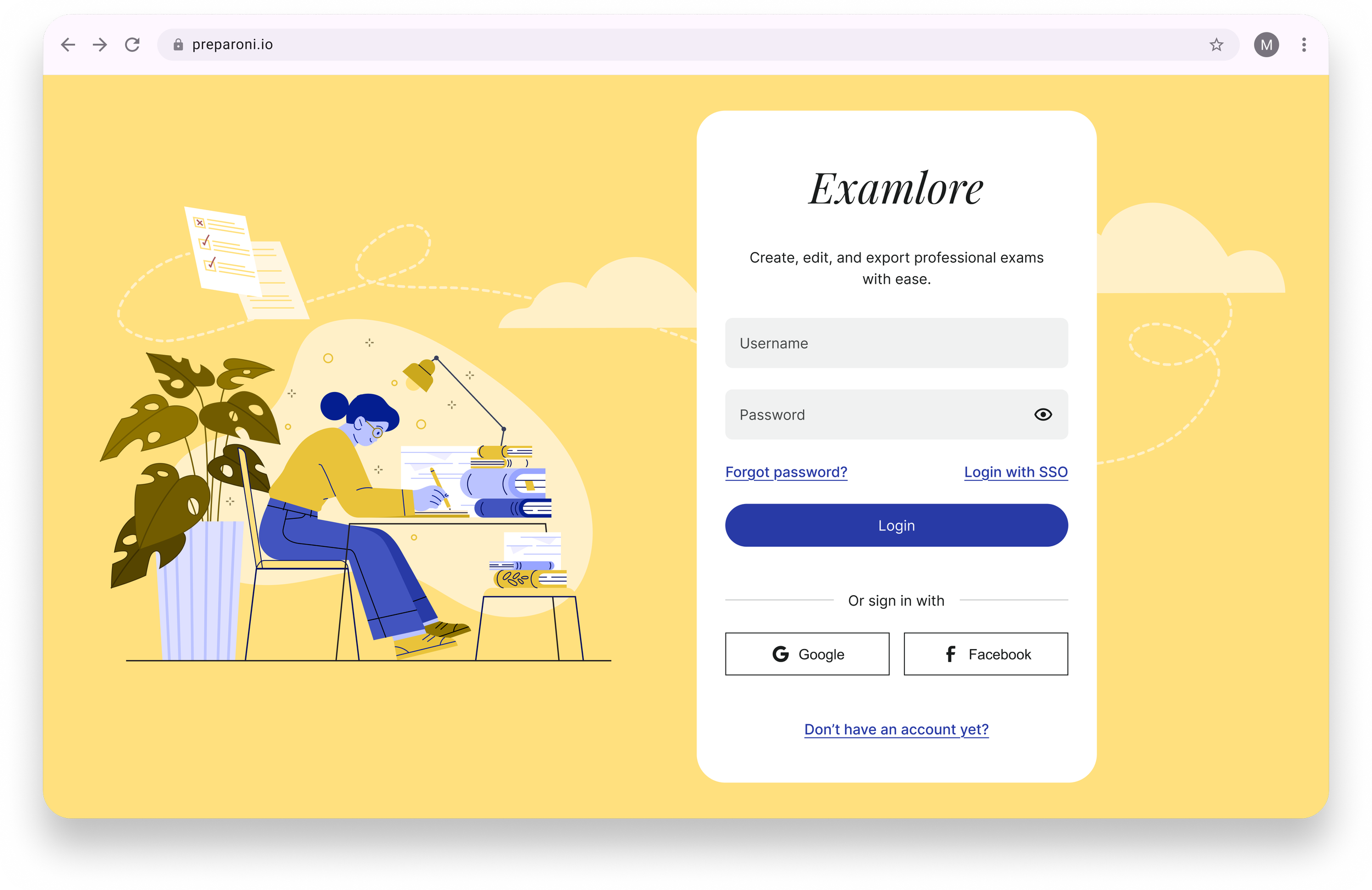
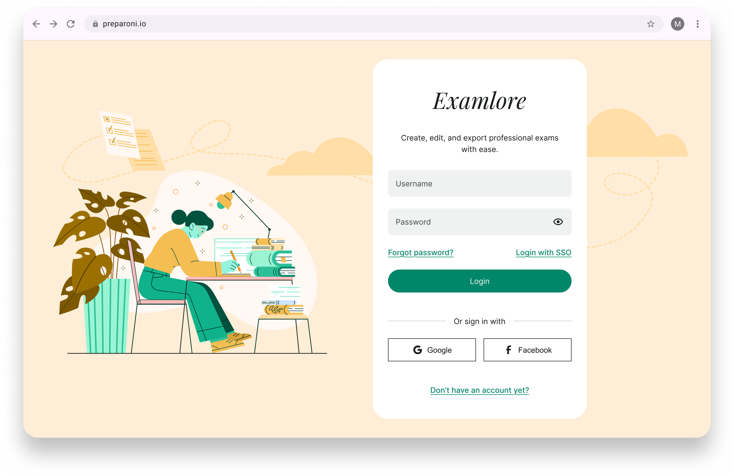
Primary green tone and secondary yellow tone evokes key emotions in users such as growth, nature, optimism, warmth. This combination feels fresh and engaging, suitable for vibrant and optimistic interactions.
Hi-Fidelity Prototype
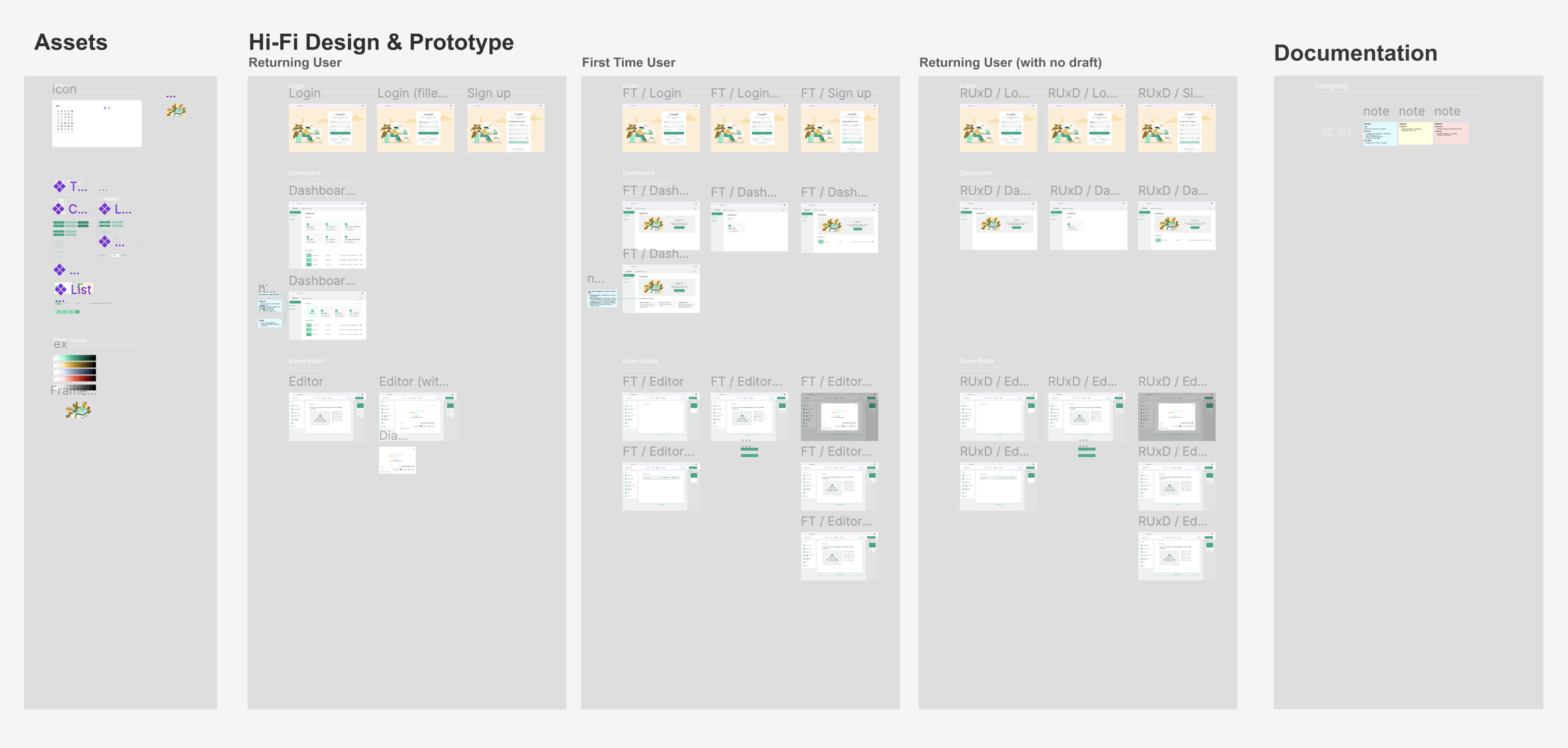
For this project, I created the First Time to illustrate empty states and Sign up flow, and Returning user scenario for happy flows. The client requested for an additional flow for Returning user with no draft.
As this was my first time working on a project as a freelancer, I thought it incredibly important to document changes requested, in progress and completed to keep visible track of time, energy and cost of the project. I took the initiative to also log feedback in a GDoc to communicate with the client as it was their chosen mode of communication.
Final Design
Demonstration of Examler Web app (Returning User flow)